
Healthcare Analytics That Actually Makes Sense
Stop wrestling with generic BI tools that don't understand healthcare. Upload your CSV files and get instant answers about patient trends, readmissions, and operational efficiency.
Built by healthcare technology experts, trusted by practices across US, UK, EU, and Middle East
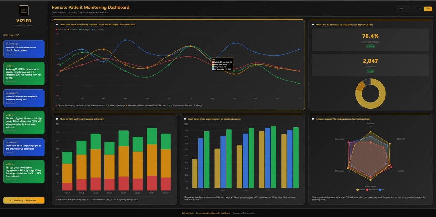
Real healthcare dashboard - not generic business charts
About Vizier by The Algorithm
We specialize in healthcare analytics that actually make sense to clinical and operational teams. Unlike generic BI tools that require months of customization, Vizier understands readmissions, quality measures, and healthcare workflows from day one.

Our Mission
Our Expertise
Built by healthcare technology consultants with years of health system experience, Vizier provides purpose-built analytics for healthcare organizations. Our platform speaks healthcare natively - from MIPS compliance to operational efficiency - without requiring business analyst interpretation.
Purpose-Built for Healthcare Workflows
Unlike generic BI tools, Vizier understands clinical operations, regulatory compliance, and healthcare revenue cycles from day one.
Clinical Intelligence


Engage with data through intuitive conversations for deeper insights and understanding.


Operational Efficiency
Staff productivity, patient flow, and resource utilization insights for healthcare operations
MIPS reporting, quality measures, and compliance tracking across US, UK, EU, and Middle East
Regulatory Compliance

Built by The Algorithm's healthcare consulting team with proven experience serving health systems across multiple regions.
Subscribe for Insights
Stay updated on healthcare analytics trends.
Insights
Transforming healthcare data into actionable insights.
Trust
Connect
info@vizier.health
© 2025 The Algorithm. All rights reserved.